Data visualization is a crucial aspect of data analysis helping teams make informed decisions quickly. With Streamlit, you can build interactive and beautiful dashboards in just a few lines of Python code. No need for web frontend skills or expensive vendor tools like Power BI.
In this post, we’ll walk through a simple Streamlit app that visualizes engineering commit activity over a range of days using a dataset.
Streamlit is an open-source Python framework that makes it incredibly easy to build web apps for data science and machine learning projects. Unlike traditional web development frameworks, Streamlit eliminates the need for HTML, CSS, and JavaScript, allowing you to focus purely on Python code.
Some key advantages of Streamlit:
Let’s create a basic Streamlit app that visualizes the number of commits one engineer has made over a range of days. Install Streamlit If you haven’t already installed Streamlit, you can do so using pip:
pip install streamlitHere’s a simple Streamlit script that reads a dataset (my_data.csv)
day,commits
0,5
1,4
2,4
3,5
4,5
5,3
6,5
7,4
8,6
9,7
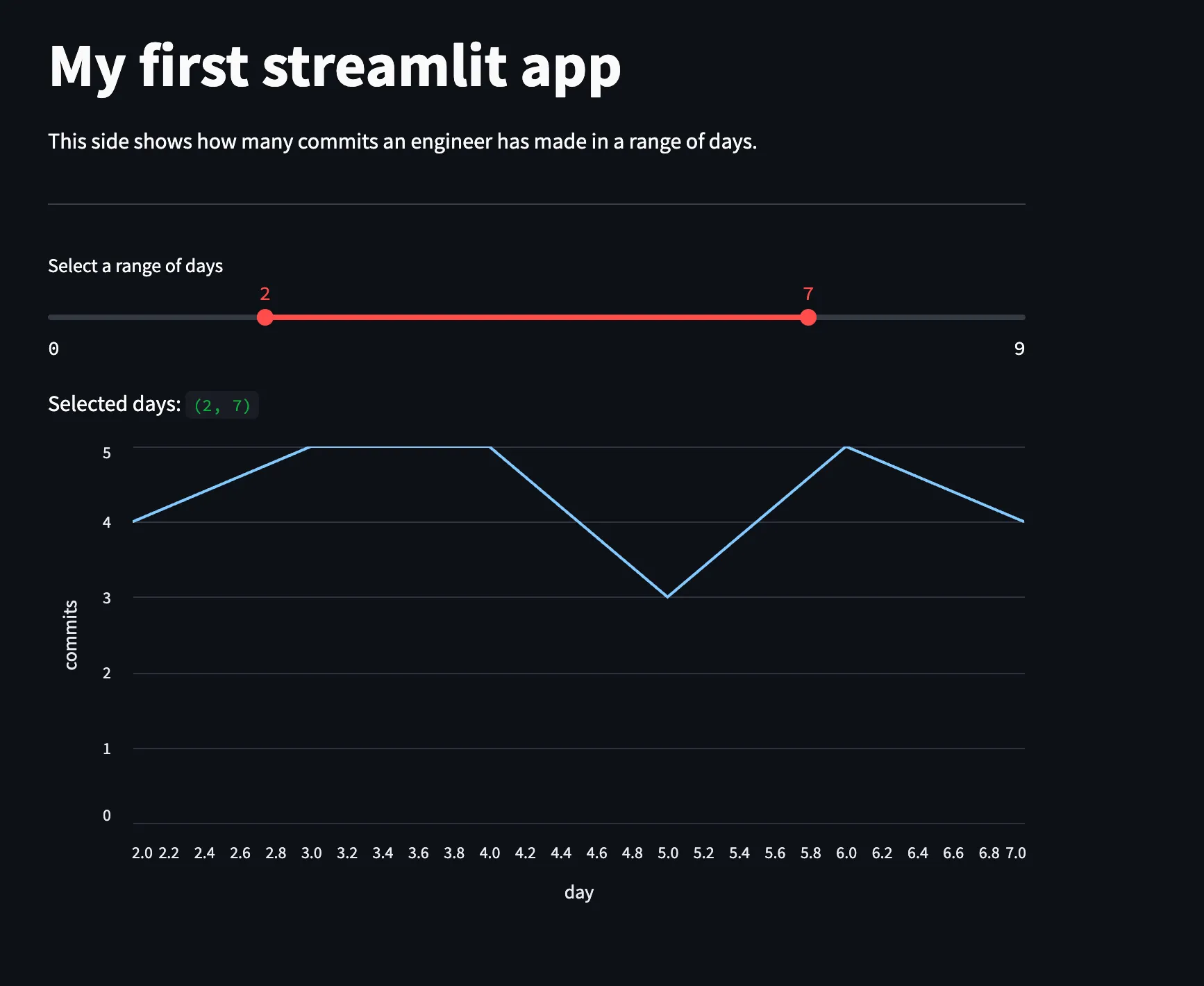
and allows the user to filter data by a range of days, and plots a line chart.
Save this code in a file named my_first_app.py:
import streamlit as st
import pandas as pd

# Load dataset
df = pd.read_csv("my_data.csv")

# Set title of the app
st.title("My first streamlit app")

st.write("""
  This dashboard shows how many commits an engineer has made in a range of days.
  ----
""")

# Create a slider to select a range of days
min_day = df["day"].min()
max_day = df["day"].max()

days = st.slider("Select a range of days", min_day, max_day, (3, 8))

# Filter the dataset based on the selected range
df_filtered = df[(df["day"] >= days[0]) & (df["day"] <= days[1])]

# Display the selected range
st.write("Selected days:", days)

# Plot the line chart
st.line_chart(df_filtered, x="day", y="commits")To launch the Streamlit app, navigate to the directory where your script is saved and run:
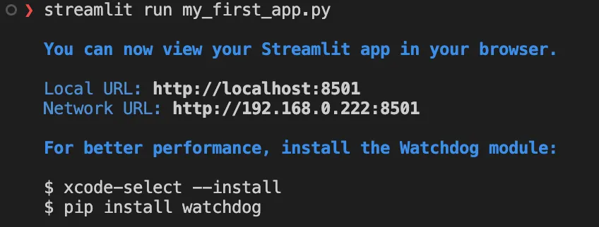
streamlit run my_first_app.py
Within seconds, your browser will open automatically, displaying an interactive dashboard where you can select a range of days and see how commit activity changes over time.

Why Use Streamlit?
Finally, I wish you a pleasant journey building your own beautiful Streamlit dashboards and I will see you in the next blog article.